Tuesday, June 15, 2021

Stamping with Blocks - Expanding your Possibilities

Sometimes it amazes me how everyday items can be used when you make cards.  In this video, I show how you use rubber bands and a block to make a unique and graphic background design.  It has been a while since I've made cards with this technique, so I had lots of fun revisiting it.  I hope you learn something new and stretch your stamping skills just a bit!

Gather your supplies:
  • Cardstock:  Daffodil Delight 8-1/2" x 5-1/2" plus a scrap; Basic White 3-3/4" x 5", 3-1/2" x 4-3/4", 3/4" x 2", 3" x 5" (petals and leaves); Fresh Freesia 3-5/8" x 4-7/8"; Polished Pink 3-3/4" x 5"
  • Stamp set: Pansy Patch (bundle)
  • Ink:  Polished Pink, Fresh Freesia, Daffodil Delight, Granny Apple Green
  • Block D (but you could use other sizes
  • Rubber Bands, preferably in a variety of widths
  • Blending Brushes
  • Adhesive and Tools

The first thing you'll need to do is wrap your rubber bands around your block.  Try to position your rubber bands so that they cross all over the block, criss crossing them so that you don't have any large open areas on the block that might pick up ink when you stamp on the ink pad.

Stamp with the banded block onto the smaller white rectangle (the larger piece is for the inside of the card) in Fresh Freesia.  It's up to you how much coverage you desire, but I chose to keep this one fairly sparse.  Adhere the two layering pieces (Fresh Freesia and Polished Pink) and set this aside.

Using the Stampin' Cut and Emboss machine and the dies from the Pansy Patch bundle, cut out several leaves (I used two large and one small) and the flower petals from the 3" x 5" rectangle of white.  These are beautifully embossed with details that give the flower and leaves a realistic look.

Protect your work area with scrap paper and use the blending brushes to add color to your die cut petals and leaves.  I used Polished Pink for the flower - blending from the center of the petals toward the outside edges, but leaving the petals mostly white.  The leaves were colored with Granny Apple Green and had a full ombre look.  To clean your brushes, wipe them on your scrap paper until you see no more color coming off on the paper.  If desired, you can also add a little rubbing alcohol to a paper towel and rub the brushes again.  I find this to be a very effective way of removing any color that remains without soaking the brushes in soapy water.

Assemble the flower pieces with glue and attach to the layered piece with dimensionals.  Keep the dimensionals a little away from the outside edges so you have space to tuck under the leaves.  Add the leaves, making sure you have space for the sentiment.  Stamp the sentiment on the small strip of white in Polished Pink and trim the right side with your paper snips.  Adhere this flat to the card, tucking it under a leaf.  The final step for the card front is to add dimensionals to the the layered piece and attach it to the card base (which you've folded and burnished with the bone folder).

For the inside of the card, stamp your sentiment in Granny Apple Green.  Then take a scrap piece of paper to mask off most of the inside panel (I left about 3/4" showing at the bottom).  After cleaning your banded block, stamp in Daffodil Delight along the bottom.  While you have the block inked, stamp the flap of your envelope to match.


As I mentioned in the video, I had lots of fun making more samples for you to see.  The first one is super simple and would make an awesome birthday card for a guy.  I used Basic Gray, Real Red and black StazOn.  The background is very sparse and the words are from Biggest Wish.  Quick and easy, but still impressive.


This next one is my favorite, even though it is super simple!  I stamped Poppy Parade, Daffodil Delight, Granny Apple Green and Pacific Point onto 1" x 3" strips of Basic White. After adding them to a layer of white, matted in black, the final touch is a popped up sentiment strip with flagged ends.  I used another new stamp set called Create with Friends.  I really love the intensity of the colors and it was simply attained by stamping a few more times.


So far, all of my samples have been made using one color of ink.  Time to branch out!  This adorable card started with Pool Party, followed by Coastal Cabana, Bermuda Bay and a touch of Pacific Point.  The Party Puffins, which aren't too difficult to fussy cut, and a simple label make this card a winner. 


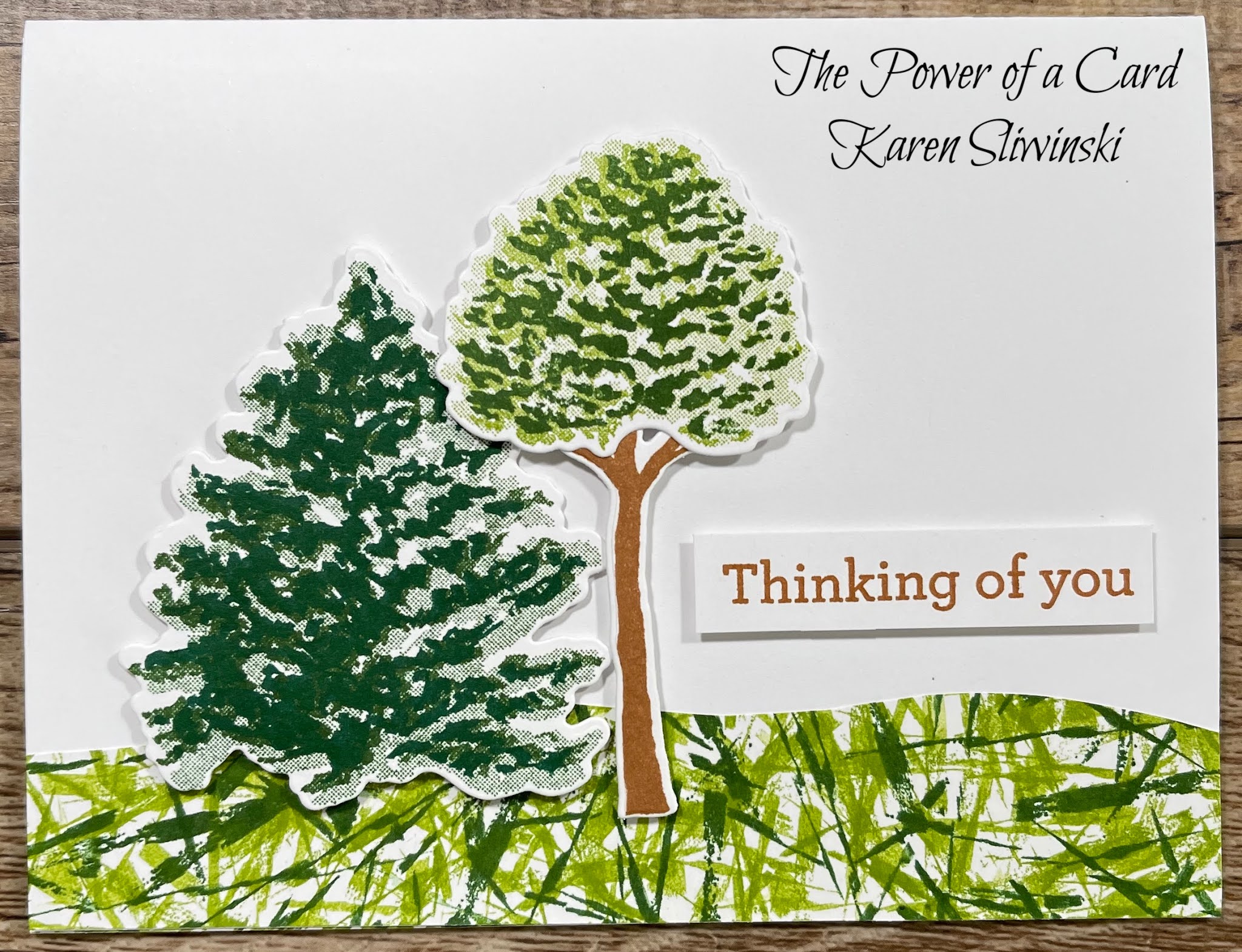
The remaining two cards use two colors each.  For my tree card, I used a strip of basic white and stamped with Granny Apple Green and Garden Green.  Using my snips, I cut the piece into a wavy section to resemble the grass under the trees (which came from the Beauty of Friendship bundle).  I used the part I cut off for the inside.  The dog card features Hot Dog (which sadly, is retiring this month), the Scalloped Contours dies and Heart Punch Pack.  I used Bumblebee and Cinnamon Cider as my color palette.


I hope you have enjoyed this technique.  If you need any of the supplies for these cards, please shop in my on-line store.  Your support of my business helps me to provide videos and I truly appreciate that!  I also am thankful for you sharing my videos with others, commenting and giving me a thumbs up.  Until next time,

Karen


ThePowerOfACard@gmail.com

Etsy Shop: The Power of a Card

https://karensliwinski.stampinup.net 

Images Copyright Stampin’ Up!®


Join my Facebook Group (The Power of a Cardmaker)https://www.facebook.com/groups/1042676296088278/?ref=share


My current host code is: WFKAKWQQ  Please use this for orders less than $150 

and you’ll get a special treat from me.  For order over $150, you will

qualify for host rewards from Stampin’ Up! (plus a treat from me!).


Product List
Pansy Patch Bundle (English)
$51.25
Daffodil Delight 8-1/2" X 11" Cardstock
$8.75
Polished Pink 8 1/2" X 11" Cardstock
$8.75
Fresh Freesia 8 1/2" X 11" Cardstock
$8.75
Basic White 8 1/2" X 11" Cardstock
$9.75
Fresh Freesia Classic Stampin' Pad
$7.50
Polished Pink Classic Stampin' Pad
$7.50
Granny Apple Green Stampin' Pad
$7.50
Daffodil Delight Classic Stampin' Pad
$7.50
Clear Block D
$8.50
Blending Brushes
$12.00
Paper Snips
$10.00
Bone Folder
$7.00
Paper Trimmer
$25.00
Multipurpose Liquid Glue
$4.00
Stampin' Dimensionals
$4.00
Stampin' Cut & Emboss Machine
$120.00

Monday, May 31, 2021

Color Blocking Using Textured Stamps

The layout in this card is simple and quite versatile.  Just three rectangles added to another rectangle as a mat can give you a surprisingly amount of variety!  Today, I focus on adding texture to those rectangles, or color blocks, by using stamps.  As you can see in the video, you don't always have to have a "texture" stamp to achieve a cool look.  Let's look closer at how I made my card:

ThePowerOfACard.blogspot.com   Karen Sliwinski   ©Stampin’ Up!


Gather your supplies:

  • Cardstock:  Polished Pink 8-1/2" x 5-1/2"; Basic White 4 x 5-1/4", 1" x 5", 2-5/8" x 3-1/4", 2-5/8" x 1-5/8", 6" x 3" (for label and flower)
  • Stamp sets: Artistically Inked and Hand Penned Petals (bundle)
  • Ink:  Basic Gray, Polished Pink, Fresh Freesia, Daffodil Delight, Soft Succulent
  • Tasteful Labels dies
  • Stampin' Blends: Polished Pink, Fresh Freesia, Daffodil Delight, Soft Sea Foam, Soft Succulent
  • Adhesive and Tools

Fold your card base, crease well and set aside.  Using the large "blotch" from Artistically Inked, add color to each of the three color block pieces.  I used Fresh Freesia on the one inch strip, Polished Pink on the small rectangle and Daffodil Delight on the large rectangle.  Cover the entire piece with texture - it's ok to overlap the stamped image.  Now add them to the white mat (you should have 1/8" border around all of the pieces).  Add this to the card base.

Cut out a label from the large piece of white and stamp your sentiment on the right side in Soft Succulent Ink.  Stamp your floral image on the remaining scrap of white in Basic Gray.  Color with Blends, then use the die to cut it out.  Place dimensionals on the back of the label and adhere to your card front.  Add the floral image, adding a dimensional to the portion of the flower that hangs off the label.


As I mentioned, this layout is quite versatile.  Here is the same card, just in a different color palette.  I used Daffodil Delight, Poppy Parade, Balmy Blue and Granny Apple Green.  If you wanted this one to pop a little more, replace the gray with black.


The color blocks don't have to be different colors, or in the same orientation.  In this card, I stamped three textures from Tasteful Touches in Basic Gray and matted them in Smoky Slate.  My label is a Stitched Rectangle and I wrapped some black Baker's Twine around the end.  What a fabulous masculine card!


Look closely at my next card.  How did I make that texture? I bet you don't recognize it - it's an evergreen tree from the new Beauty of Friendship stamp set! I used Pale Papaya, Pear Pizzazz and Night of Navy and stamped the tree in the same color ink.  For a softer texture, you could stamp in Versamark, but I liked the look when I stamped in the same color ink. 


ThePowerOfACard.blogspot.com   Karen Sliwinski   ©Stampin’ Up!

My final example is just using paper for the color blocks.  Our 6" DSP packs in all of our color families work very well for this card because the patterns have a smaller scale and are mono chromatic.  You get the texture without any stamping at all!  But don't limit yourself to these packs - you can use this layout with any combination of DSP patterns.

My final challenge to you is to look at your stamp sets with a different eye.  Look beyond the original purpose of the stamp and see if you can turn something into a "texturizer".  Flowers and greenery often work quite well.  Of course, there are large background stamps too.  You might not think of them because you are covering such a small area.  And one last thought - even though I didn't show it in my video, you can use embossing folders to add real texture to your color blocks.  


Karen


ThePowerOfACard@gmail.com

Etsy Shop: The Power of a Card

https://karensliwinski.stampinup.net 

Images Copyright Stampin’ Up!®


Join my Facebook Group (The Power of a Cardmaker)https://www.facebook.com/groups/1042676296088278/?ref=share


Wednesday, May 19, 2021

Peach Fuzz? Faux Suede

This technique is simple and an effective way to add dimension and texture to your cards without adding bulk.  In my video, I show you how to distress cardstock to separate it into layers which look and feel like suede!  It was the perfect addition to my cards featuring the Sweet As A Peach stamp set.  


Gather your supplies:

  • Cardstock:  Thick Basic White 8-1/2" x 5-1/2"; Pear Pizzazz 1-5/8" x 5"; You're a Peach DSP " 4-1/4" x 2"; Basic white 2-1/2" square
  • Stamp set: Sweet as a Peach
  • Ink:  Calypso Coral, Pear Pizzazz, Old Olive
  • Label Me Lovely Punch
  • Basic White Envelope
  • Adhesive and Tools (including a bone folder)


To create the faux suede, take your Pear Pizzazz paper and run it between your thumb and the bone folder - over and over and over, and in every direction until the paper becomes very supple and starts to separate.  When you can see separation at the edges, gently pull the layers apart.  Most of the time, you can use both sides of the piece, which now looks and feels like suede.  Flag one end of this piece and you are ready to start assembling your card.

Score the card base and burnish with the bone folder.  Add the sueded piece with glue - tape runner type adhesives aren't the best choice for this delicate piece because they often lift off fibers rather than stick to the piece.  Add the DSP to the top of this piece.

On the small piece of white, we will be stamping the peach.  But because we want this image stamped off, why not stamp the envelope first?  Stamp the peach in Calypso Coral on the envelope, then on the small piece of white.  Repeat with the stem and leaf using Pear Pizzazz.  Add the sentiment with Old Olive.  Punch using the Label Me Lovely punch and add to the card front with dimensionals.


If desired, stamp the branch with leaves on the inside of the card and add the peaches and a sentiment. It's quite easy to line up the peaches with the branches - I show you how to look for the indents in the peaches and connect them to the stems.  For the flowers, turn the branch and leaves upside down and the flowers will fit perfectly where the peaches were!  Very clever design indeed.


My other cards use a circle and scalloped rectangle as the sueded element.  This suite of products is simply lovely and I hope it inspires you to make some peachy cards of your own!


Karen


ThePowerOfACard@gmail.com

Etsy Shop: The Power of a Card

https://karensliwinski.stampinup.net 

Images Copyright Stampin’ Up!®


Join my Facebook Group (The Power of a Cardmaker)https://www.facebook.com/groups/1042676296088278/?ref=share


Product List

Wednesday, May 5, 2021

Kintsugi Inspiration - Using Gilded Leafing

The Japanese art form of Kintsugi is incredibly beautiful.  By using lacquer mixed with gold powder (or silver or copper), pottery is repaired and the end result is often more lovely than the original piece!  What is moving is the thought that even though something can be broken, it doesn't have to be thrown away and often, is more beautiful than before the break.  


The card I made today was inspired by Kintsugi and these two cards.  The first card was one I made at my April card class.  We tore the edge of paper, added some glue, and then added Gilded Leafing to the mostly dry edge of paper.  Then, Penny Miller (my bestie and downline) took inspiration from this card and my technique about using Stampin' Blends, vellum and alcohol to make a card for me.  When my daughter Kristin saw it (she was visiting me to help with our move), she said it looked like Kintsugi.  That is how I came up with the design for the card in my latest video.


Gather your supplies:

  • Cardstock:  Thick Basic White 8-1/2" x 5-1/2"; Mossy Meadow 3-3/4" x 5"; Beauty of the Earth DSP " 3-1/2" x 4-3/4" (if desired, 1/2" x 4-1/4" for the inside); Gold Foil 1-3/4" x 5"; Basic white 1/2" strip for sentiment
  • Stamp Bundle: Quiet Meadow
  • Ink:  Mossy Meadow
  • Banners Pick a Punch
  • Gilded Leafing
  • Adhesive (including Multipurpose Glue) and Tools
I must warn you that this technique can be a little messy.  The Gilded Leafing has the lightest flakes of gold you can imagine.  The slightest breath or air movement will cause the flakes to go all over.  I like to keep a small portion of the flakes from the jar (which has enough to last a lifetime!) in a large container with a flat bottom.  This allows me to place my card panel into the flakes rather than try to apply the flakes to the card.  

Start by putting scrap paper onto your work surface.  Add thin lines of glue, making sure you go all the way to the edges of your DSP.  This is where you decide how many "breaks" you will have in your design.  I kept this one fairly simple, but you could add more lines.  Now, you need to allow the glue to almost dry completely, but not quite.  It needs to be tacky so the Gilded flakes will adhere.  Add your flakes to the glue lines and press them into the glue.  When this is good and stuck down, brush off the extra pieces of gilding with either a brush (I like a toothbrush) or your fingers or a wedge of a sponge.  

The messy part is done!  Add the DSP layer to the Mossy Meadow layer.  Cut out a flower silhouette from Gold Foil using one of the dies and the Stampin' Cut and Emboss machine.  I like to cut tiny strips of adhesive from the edge of the dimensionals to pop up this flower.  Trim the bottom even with the Mossy Meadow layer.  Pop this up on your card base of thick basic white.

Stamp your sentiment on the basic white strip with Mossy Meadow ink.  Trim the end with the Banner Triple Punch.  Pop this up by using Mini Dimensionals.  

Since I loved how Penny combined techniques to make a gorgeous card for me and Greg (our first card congratulating us on buying a new home), I wanted to make a similar one using some of our new In-Colors.  I chose Polished Pink, Pale Papaya and Fresh Freesia to color on vellum.  I dotted alcohol to get more of a mottled look.  Then I used glue to go around the borders of the colors.  I mounted it onto a larger white panel and popped it up on a card base of Polished Pink.  I used Hand Penned Petals bundle to add a floral sentiment and to decorate the inside.

I hope you enjoy this technique and try it for yourself.  We do have Heat and Stick powder that allows you to stamp a design, heat it so that it gets sticky, and add your Gilded Leafing to that.  You can also place a strip of adhesive (Seal or Tear and Tape) and apply Leafing for a strip of gold.  So much fun!

Karen


ThePowerOfACard@gmail.com

Etsy Shop: The Power of a Card

https://karensliwinski.stampinup.net 

Images Copyright Stampin’ Up!®


Join my Facebook Group (The Power of a Cardmaker)https://www.facebook.com/groups/1042676296088278/?ref=share


My current host code is: FEUZGJPR  Please use this for orders less than $150 

and you’ll get a special treat from me.  For order over $150, you will

qualify for host rewards from Stampin’ Up! (plus a treat from me!).


Product List

Make Vibrant Backgrounds with Watercolor Paper & Stamping

Watercoloring is one of my many hobbies, so when I can use a watercolor technique in my card making, that's just a bonus!  When you comb...